First off, I think it's super cool that you built a fully working game and even got it set up on Steam. I very much want you to succeed and because of that I am going to give you my honest feedback in hopes you'll be able to make improvements.
The User Interface
The font size to button size ratio on almost all components of the interface is too small. I feel like I need to squint or lean forward like an old man to read them. Take the main menu for example, why are the buttons so wide?
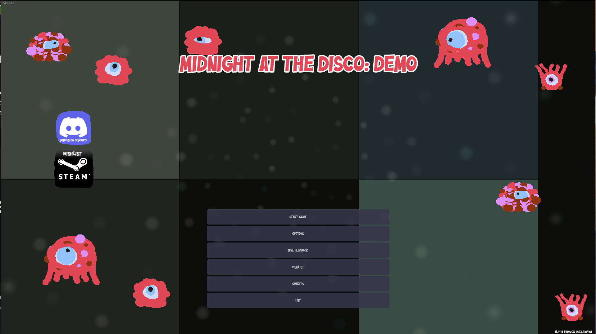
Make the buttons less wide and the font size and thickness larger. This will both improve the usability of the menu's and the look and feel of the game.
This hurts my eyes to read because of how tiny everything is. Just making this font larger would help so much.
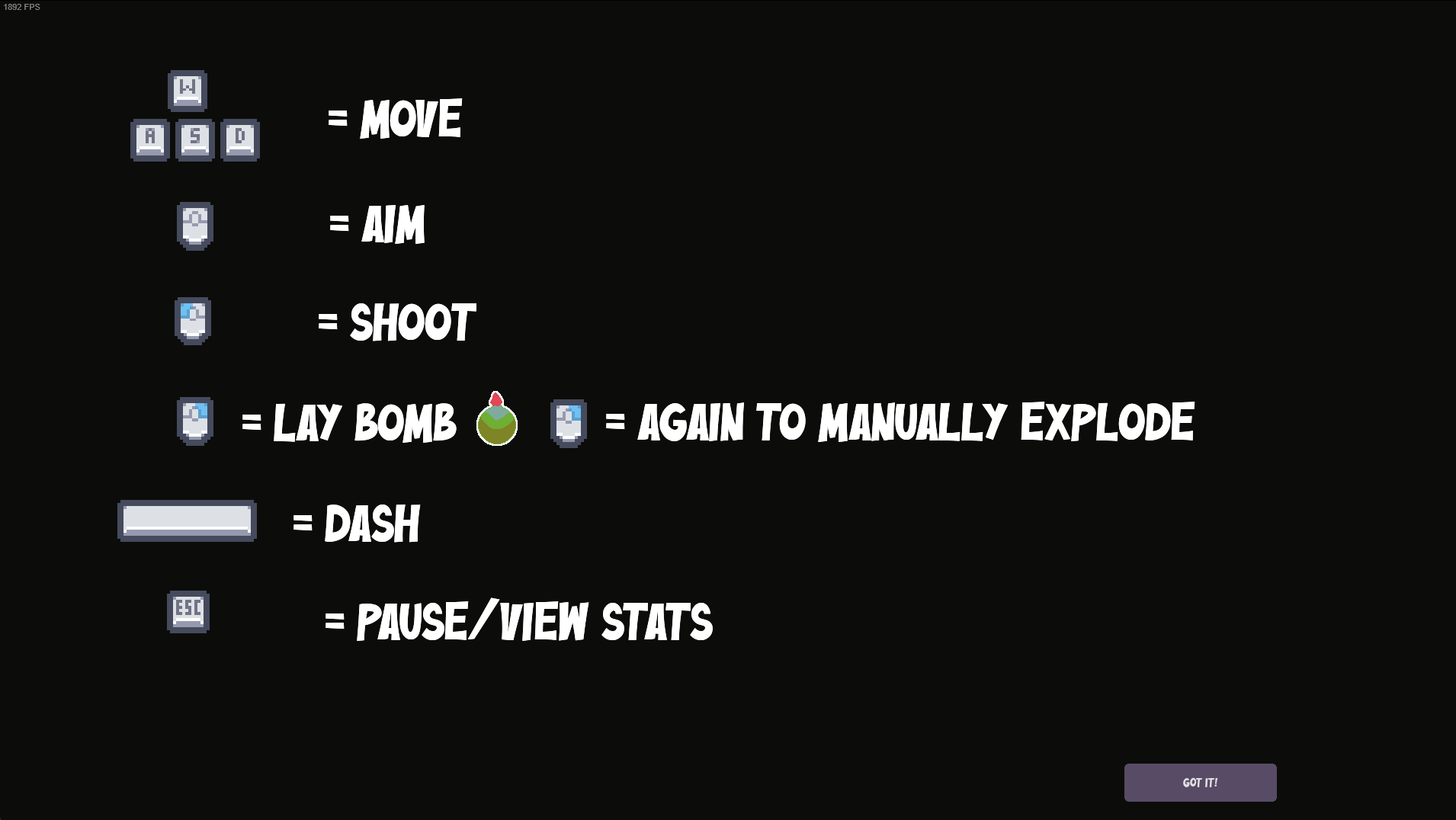
This is better, but the descriptions are not aligned with each-other at all. Also the GOT IT button on the bottom right needs the same work as the menu button. The text is too small.
Here is a mock-up of what it could look like with some simple changes. All I did here was increase the font size to 30 and gave it a black text outline with 40% opacity. Just that alone makes the main menu feel much more like your playing a game.
And with smaller buttons
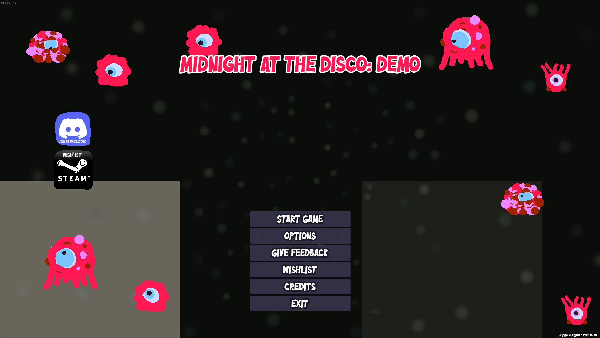
however with smaller buttons I would also increase the height of the buttons a little bit and with that increase the font size of the text proportionately. So you'd end up with a more 'bubble" like button and text.
The main thing to take away from this is that I believe the font should be larger, thicker and given a stroke. My example is font size set to 30 with 40% opacity on a 5 pixel wide outside stroke.
Make this change across every piece of your UI outside of description text and I think it will have make a massive difference.
Personally I'm not a fan of the massive game cursor or the shape. I find that when playing it often completely hides and covers many of the monster sprites.
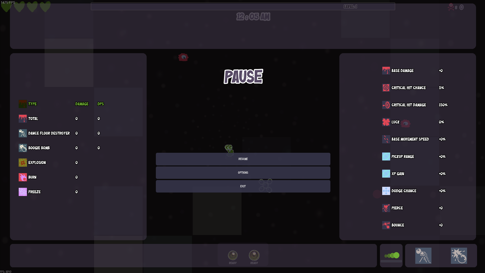
Again, pause menu buttons need the once over I mentioned above. The "PAUSE" Title is decent, but it could be a little larger given how much empty space is around it not being used.
The right hand stats are a little hard to read with how small the text is, I think increasing the font size of those and reducing the margins / padding between each stat would help.
I'm not really a fan of the very "boxy" layout of the pause menu with gaps between each section. I think if the pause menu was just a solid color that completely hid the game screen (so no transparency on it) it would look a lot better. When you pause, you don't need to see state of the board, having it there make it a little harder to keep the stats and abilities information clean.
And because you have a built in delay before the action begins when exiting the menu, having it visible so that you "know where everything is before you unpause" isn't really a valid use case.
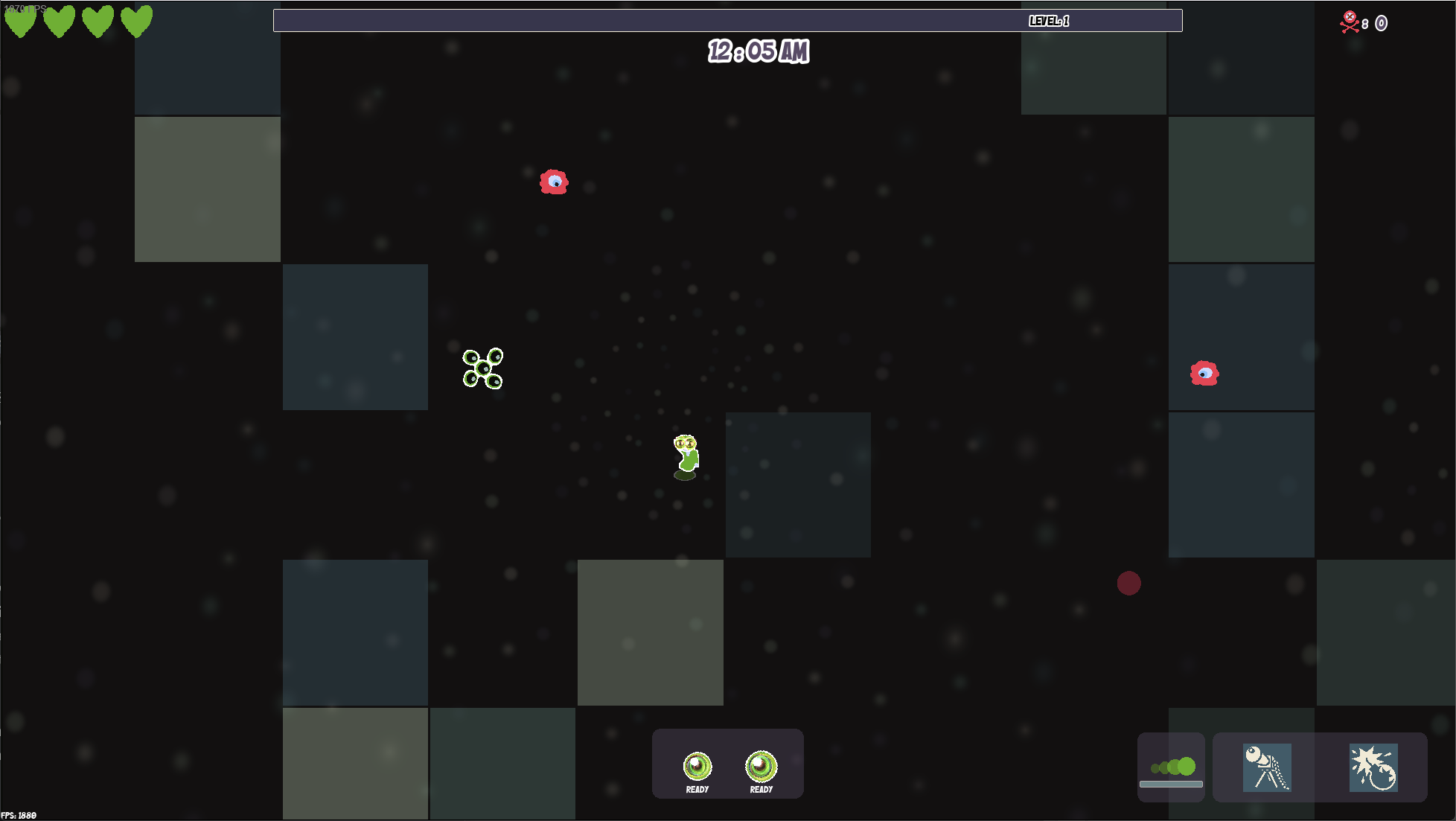
The hearts in the top left corner, why are they green? I get that a lot of the game is themed around the color green but hearts / life points in pretty much every video game that exists are always red. I didn't realize for way to long that those were my life points. Once I did realize it, I found that because they are green they blend in with all of the game action.
Make the hp hears red please.
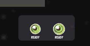
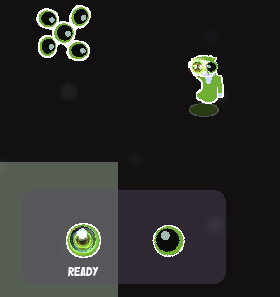
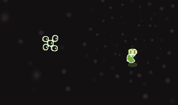
I could not for the life of me figure out what these were doing. Why are two green orb things always "ready"? How come when I right click to place a bomb one goes away and when I try to place a second bomb the other one doesn't place?
I died a couple times because I kept trying to place 2 bombs before I figured out that the left one wasn't a bomb even though it is nearly identical to the right one. It was actually the notification of when your primary weapon was ready.
Honestly I think you could just completely remove that UI component since its already on the player character which you are staring at.
Remove the left one. It's not needed, the weapon refreshes more than fast enough to warrant it. IF there is a game play situation that could occur where having it is useful. Please change the icon to be something more obvious.
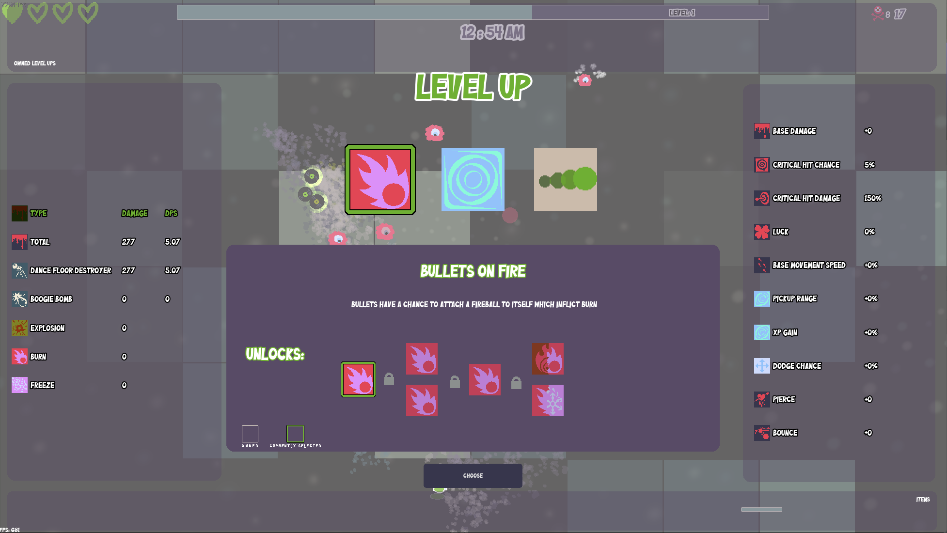
Button text "Choose" again, too tiny.
You could probably increase the font size of the description on "Bullets on Fire" a little bit.
The padding's are all sorts of out of wack and misaligned on the above screenshot. Please fix.
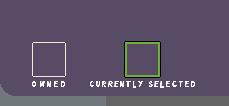
This is barely readable and the currently selected box doesn't seem to do anything. Kinda confusing if it's not a bug. I'm thinking bug?
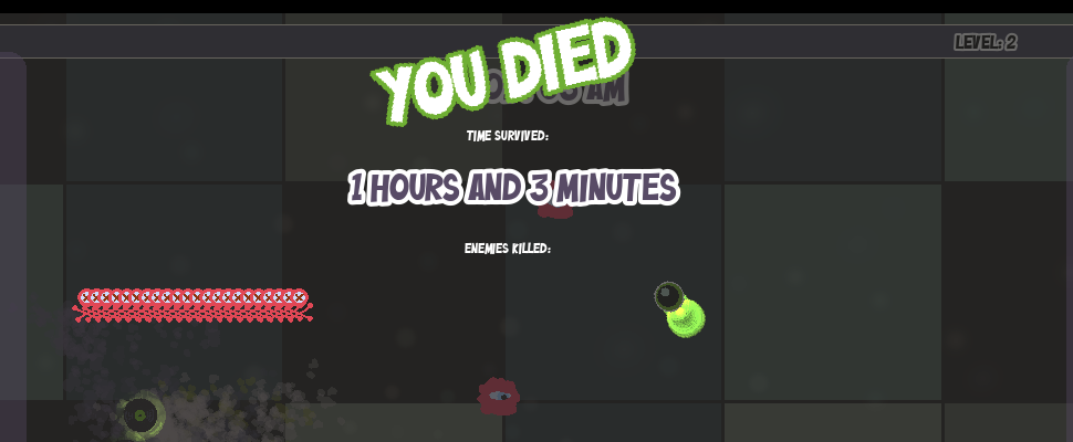
Just give me numbered stats. I don't want to hand count how many enemies I killed. People love stats in these sorts of games, so I think when you die being able to actually see NUMBERS for the various things like "enemies killed" would be a better experience. Especially when you are trying to compare whether you did better this run over your last run.
"Time Survived" and "Enemies Killed" text is way small. I feel like you made them small so that you have more empty space to fill up with the enemy count icons.
EMPTY SPACE IS BAD.
Some of your abilities refer to "Bullets" but I'm not using bullets I'm shooting my eyes? Little odd.
Game Theme
I think the disco theme is a cool idea and when I think disco I think of a dance floor with all sorts of colorful lighting. The dance floor you have comes off as a bit bland, I'm not really a fan of the color pallete for it myself but I've also never been to a disco so I'm judging this based off my percieved idea of what a disco in game form might look like.
Would be cool if the disco squares were a more vibrant set of colors. I'm picturing something more akin to this.
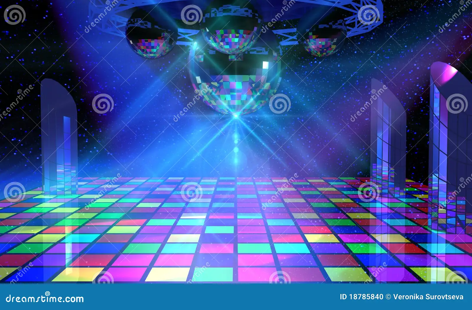
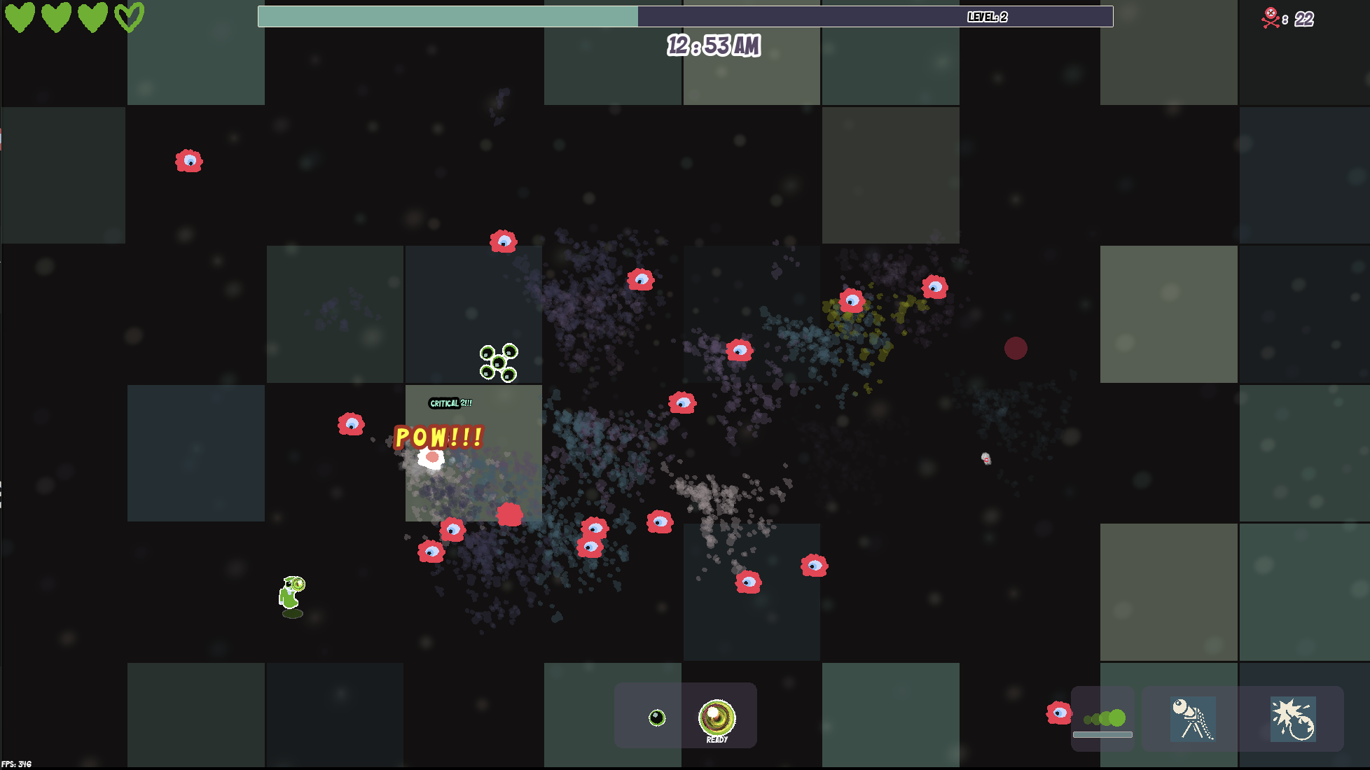
Where there is a much larger varieties of colors on the map at any given time. Right now your squares seem like they are all just slightly different shares of the same color.
I'm guessing you made them darker colors so that your monsters stand out more, but I think if you add an outline to your monsters that would solve the problem. Plus, I think your monsters are obvious enough that I don't believe it would be a problem.
I think your swirling light affects could also be a bit larger and more vibrant.
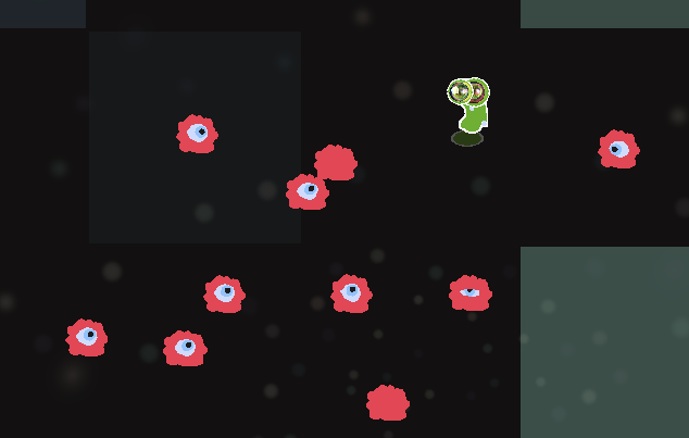
I think the eye monsters are probably fine as is, but something to experiment with that possibly could make them look a little better on the board is giving them a slight black or white outline. Similar to what you are doing with the players character.
Game Icons
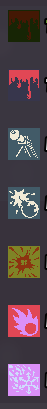

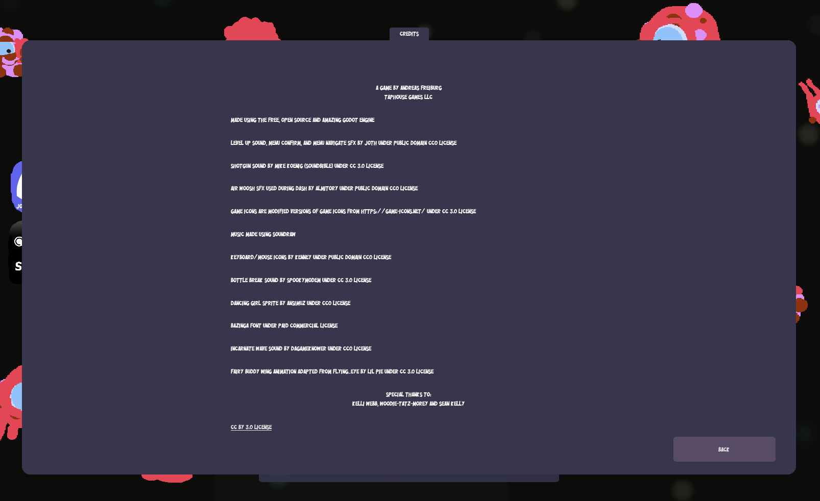
It's very obvious the icons came from an icon pack of some sorts, which is not necessarily a bad thing. My issue is that the icons don't really follow a generalized theme. And while some of the icons make sense, some of them make no sense to me. I'm not really sure how best you can improve this other than having somebody custom design you an icon set for your game that all follow the same art style and theme. Which I'm sure isn't cheap.

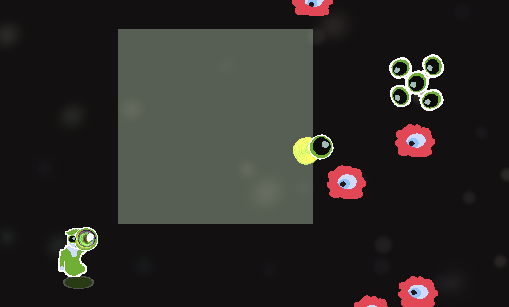
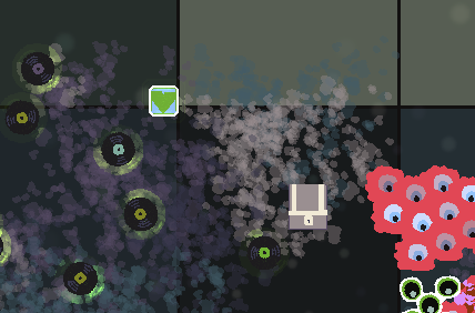
Icons that are on the game board are very easy to miss. The chest for example blends in pretty easily. I think an outline could help, or maybe some sort of animation. The green heart thing is super tiny and when you got a lot of stuff happening is impossible to see.
Sound Design
I very much hate the menu hover sound and button click sound. But that's just me and I hate most games sound effects on their ui elements. So I wouldn't worry about changing that unless you have gotten other feedback against it as well.
The primary weapon sound effect is quite harsh on the ears and I found myself immediately turning the sound effects completely off because I couldn't stand that sound effecting happening every 0.1 seconds haha.
I like the bomb countdown sound effect, I think it's good and the bomb explosion sound effect I'm neutral on.
The enemy hit sound effect is a little loud, would be nice if you could turn down the intensity on that.
The Disco Music
Is this disco? Again I've never been to a disco but as far as background music goes I wasn't super impressed with it. I will say though it wasn't really annoying. I didn't immediately go and turn the music down.
The music did get quite repetitive though. I think a larger variety of music would be good. Fade the music out towards the end and fade the music in at the beginning rather than a harsh change.
I'm sure finding music that you can license in your game isn't easy, so I can't really fault you for the music but given the game is "Midnight at the Disco" you would expect that the music represent that.
So my only advice here is definitely try to improve the music before release. How? No idea I'm not a game developer haha.
Gameplay / Game Loop
I don't have much to say on this section. I think it's fairly solid and I nothing really happened that I thought could be improved or changed. Honestly it's pretty solid, I've played a couple games like this and I can say that I think the game loop is good. I would need to play it much longer to really criticize anything such as the modifiers.
So as you make updates and as I play it more I may give you more feedback as stuff comes up but my initial impression is positive.
Comments